Pivot Table
Pivot tables expand the capabilities of regular (flat) tables by allowing you to reorganize and summarize selected data beyond the typical row-column relationship. They are typically used for analyzing sales data by region, summarizing survey responses by demographic categories, examining website traffic by source, or tracking expenses by category and month.
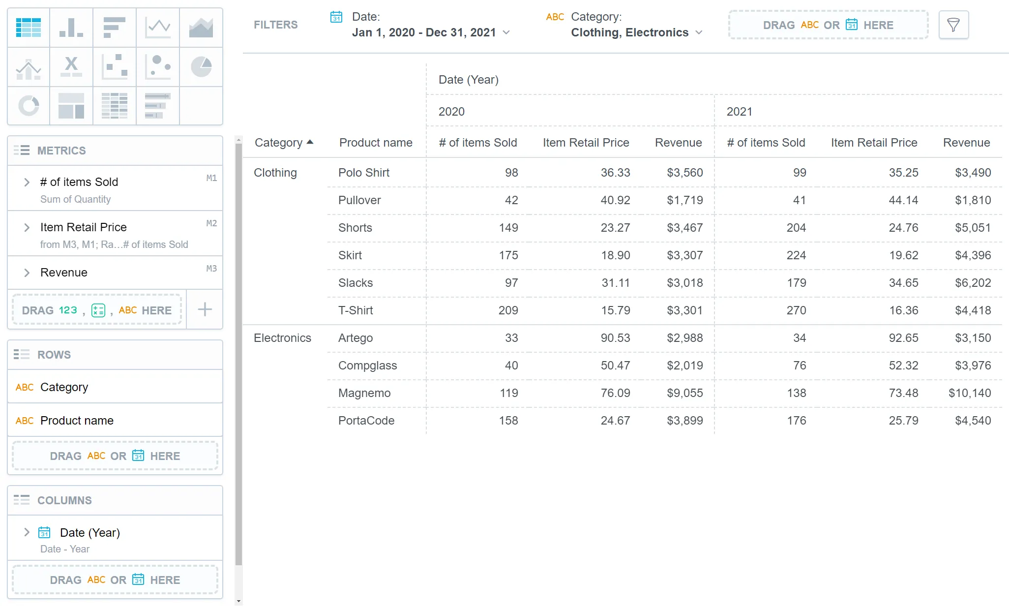
A pivot table can have up to 20 attribute rows and 20 attribute columns which refine data in your visualization. The data is then merged according to the attribute order in the Rows/Columns sections.
Pivot tables have the following sections:
- Metrics
- Rows
- Columns
- Configuration
In pivot tables, you can also:
Display the values as a percentage.
Compare your data to the previous period or the same period of the previous year.
For details, see the Time over Time Comparison section.
Group data when sorted by the first item in the Rows section.
Change the orientation of the table.
If you are using metrics, set the orientation of the table in Configuration > Metrics > Position. You can also change the orientation of the table by swapping attributes between the Rows and Columns sections.
If there are no attributes in the Rows section, you can also use Configuration > Column Headers > Position to change column headers into row headers and vice versa.
Pivot tables automatically adjust the width of the visible columns according to the cell content. The size is calculated according to the content in the header of the column that represents the lowest level of the grouped attributes.
For information about common characteristics and settings of all visualizations, see the Visualization Types section.
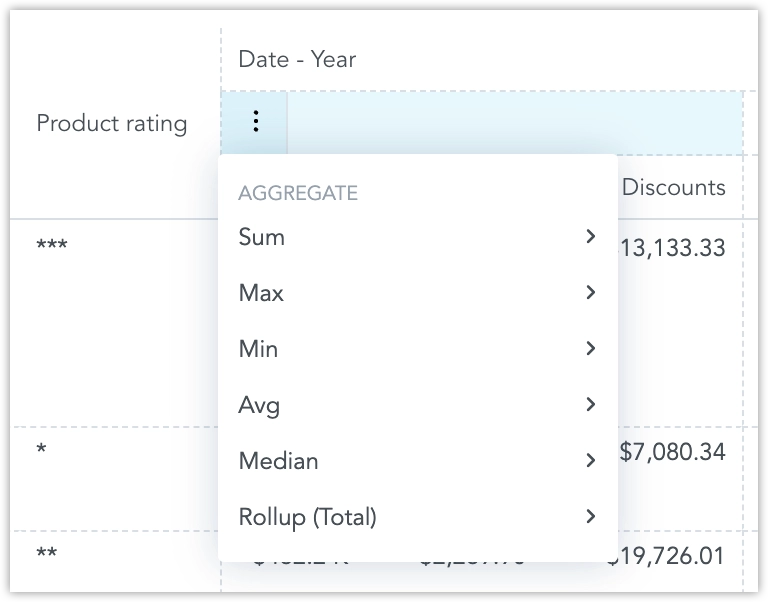
Table Totals
You can aggregate data in a table using the following aggregate functions:
SumMaxMinAvgMedianRollup (Total)
Steps:
Create a pivot table.
For details, see the Create Visualizations section.
To add table totals, the table must include at least one item in the Metrics section and one item in the Rows section.
Hover the mouse over a column header.
A burger icon appears on the left side of the header.
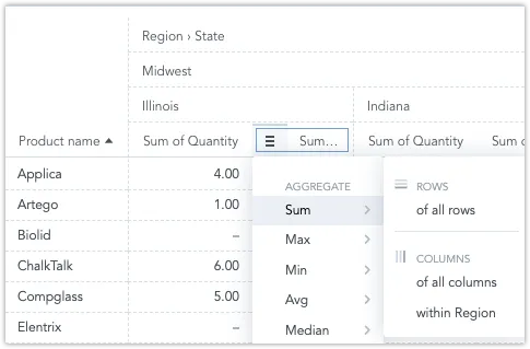
Click the burger icon and select an aggregate function.
A new row (or column, if applicable) with the function name and appropriate values under the column is displayed.
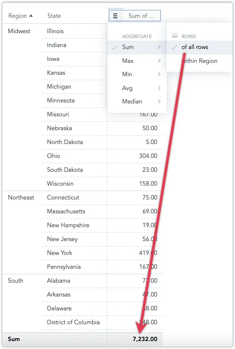
Note that you can also aggregate within individual attributes.
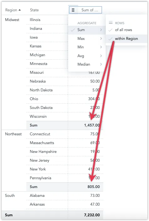
To add aggregate functions to all columns or to individual attributes or metrics, hover your mouse over column headers to display the burger icon.
The following image shows the
Sumfunction added in theYearattribute and theAvgfunction added in theCheckoutsmetric.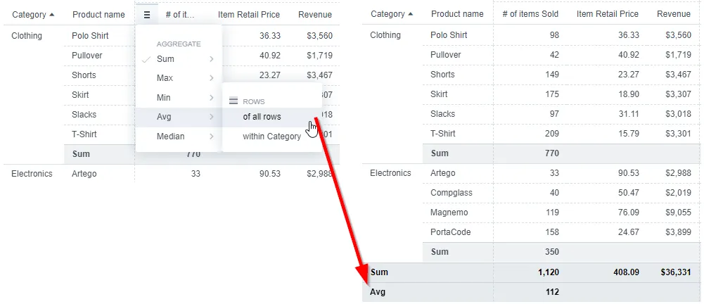
To delete an aggregate function, click the burger icon and click an already-selected function (with a tick sign) to hide the function row.
Rollup Totals
Rollup Totals are “smart” aggregations that match the metric they summarize. With Rollup Totals, you can group data by specific fields and calculate the total based on the metric definition.
Rollup Totals are especially useful for tables with average values, avoiding issues like averaging averages. They are also ideal for non-additive metrics like unique counts. For example, a single customer might appear in multiple rows of a table showing the number of unique customers per month, but they should only be counted once in the table total.
Example:
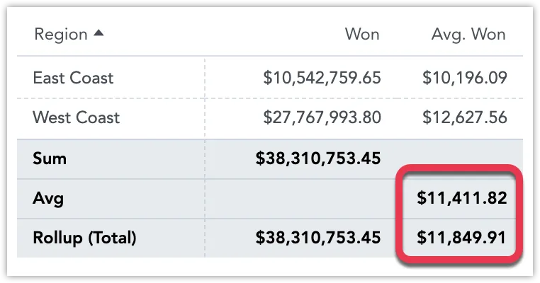
Won Metric: The rollup shows the sum of all regions’ won amounts, so the Sum and Rollup (Total) are equal.
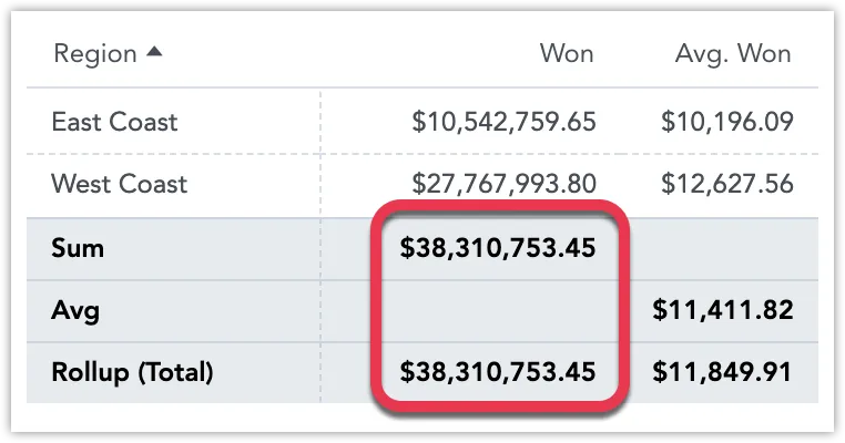
Avg. Won Metric: Instead of averaging row values (which are already averages), the rollup averages the original data before it was broken down by regions (e.g., East Coast and West Coast). Thus, the Avg (an average of averages) is different from the Rollup (Total) average (based on the original data).
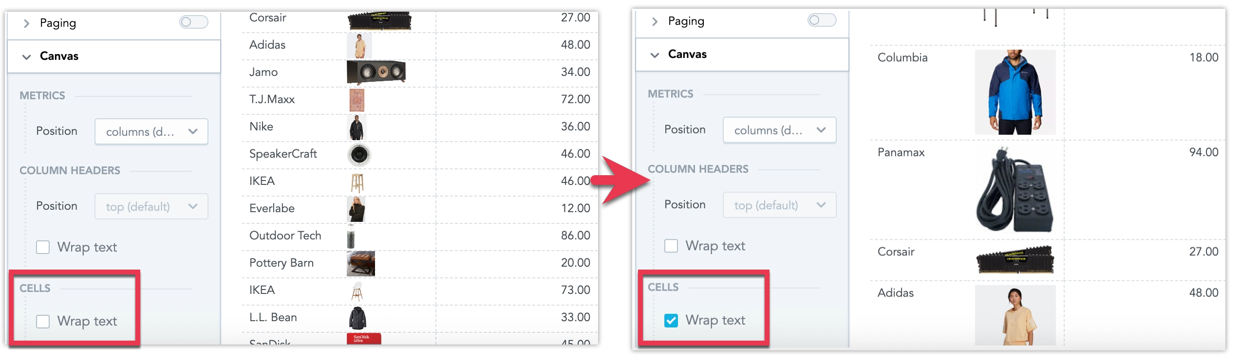
Wrap Text
Pivot tables support text wrapping to improve readability and optimize space usage in both column headers and data cells. By default, text wrapping is disabled in pivot tables.
No Text Wrapping for Metrics
Text wrapping is not applied to cells displaying metrics, as breaking numerical values across lines can make them harder to read and interpret accurately.
In Analytical Designer, you can enable or disable text wrapping for all headers or all cells separately in Configuration > Canvas:
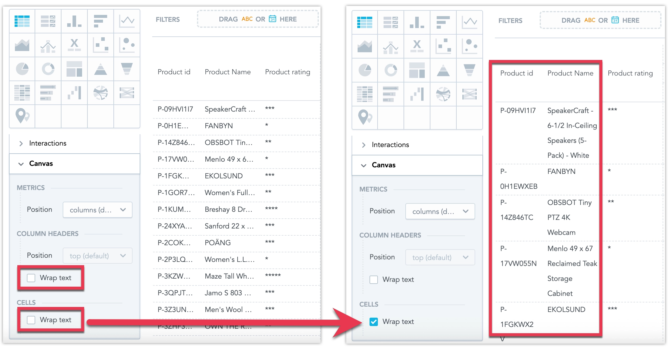
You can also override the text wrapping behavior for individual columns by hovering over them and clicking the vertical ellipsis ⋮ menu button:
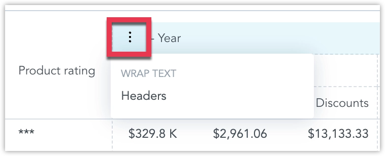
For columns with multiple nested headers, you can change the text wrapping behavior only for the topmost header. The setting is then applied to all nested (child) headers, which do not have their own wrapping option.
In dashboards, users can individually toggle text wrapping for each pivot table they view.
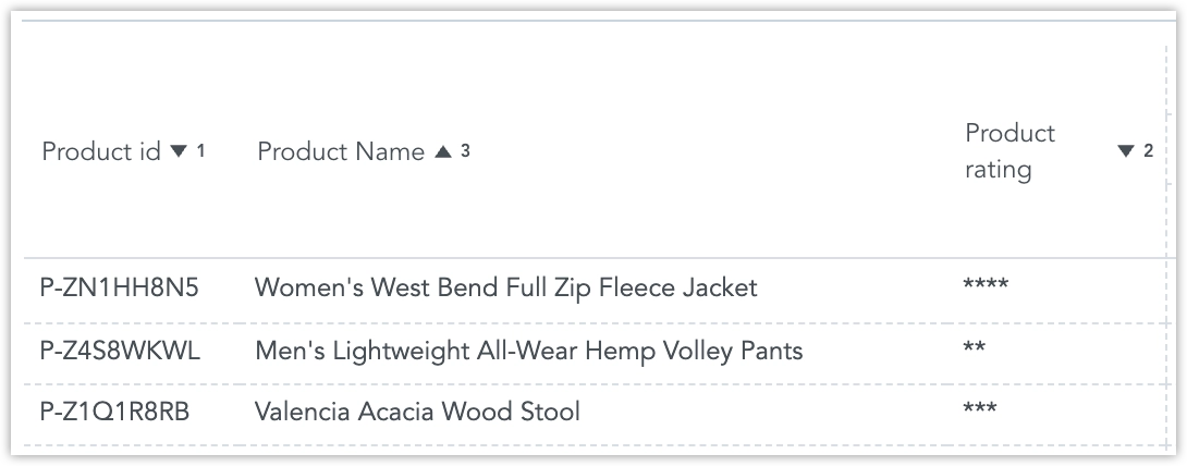
Multi-column Sorting
You can sort pivot tables by multiple columns. Apply sorting to several columns at once, each with its own priority and ascending/descending order.
Use one of the following ways of addingcolumns to the sort:
- Shift-click: Hold ⇧ Shift and click another column header to add it to the existing sort (click again to toggle direction).
- Header menu: Open the column’s ⋮ menu and choose a sort option to add that column to the multi-sort.
Clicking a column header without holding ⇧ Shift replaces the current sort with a single-column sort. Each column keeps its own direction (ascending or descending), and its priority is determined by the order in which you add it.
Multi-column sorting can be configured while exploring on dashboards and saved as a default when editing the table in Analytical Designer.
Paging
Paging lets you control how many rows are displayed in a table at once. You can enable it and select the Page size in the table’s Configuration panel.
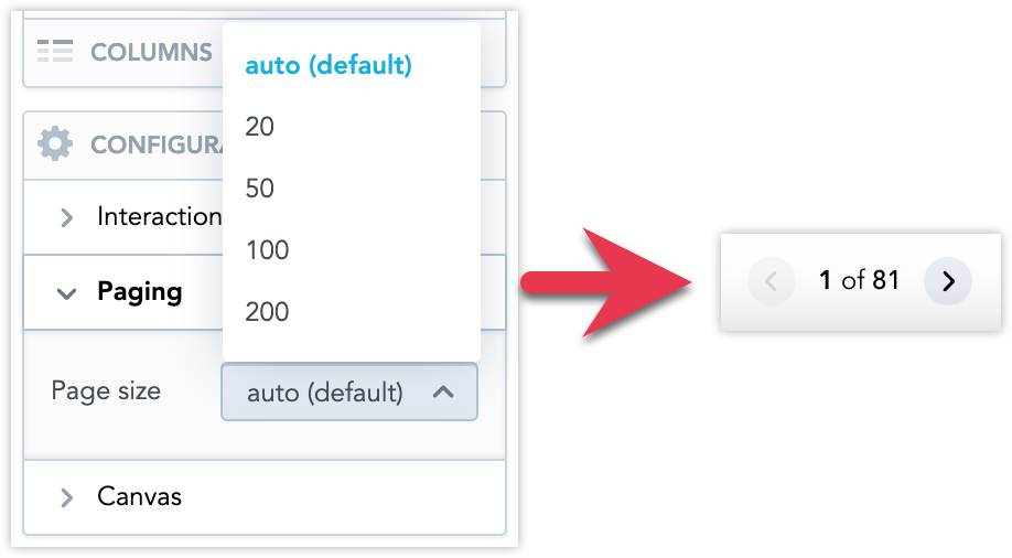
The auto (default) setting automatically chooses an optimal number of rows based on the height of the table container, but it does not account for text wrapping or varying row heights—it relies only on the default row height. This means that without text wrapping, you typically should not see a vertical scrollbar on any page, while enabling text wrapping or having rows of different heights may result in fewer visible rows and the appearance of a scrollbar.
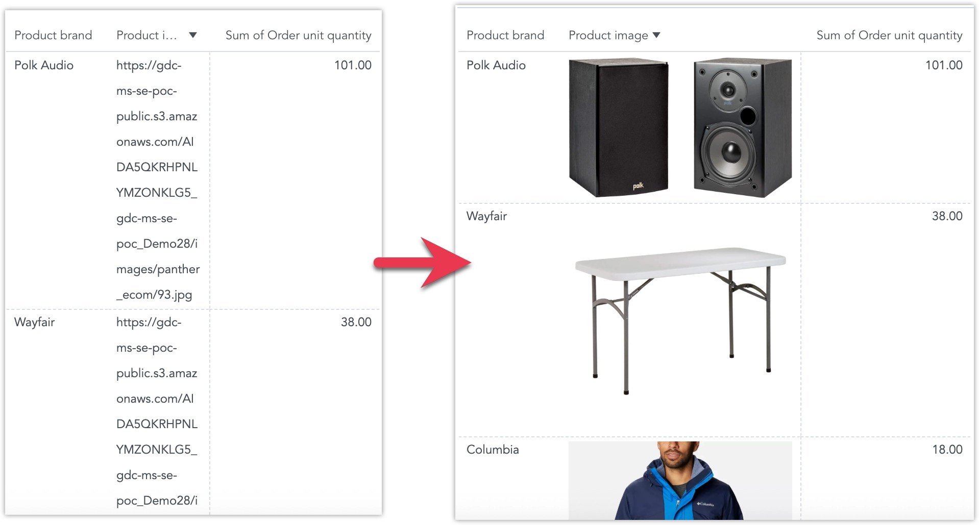
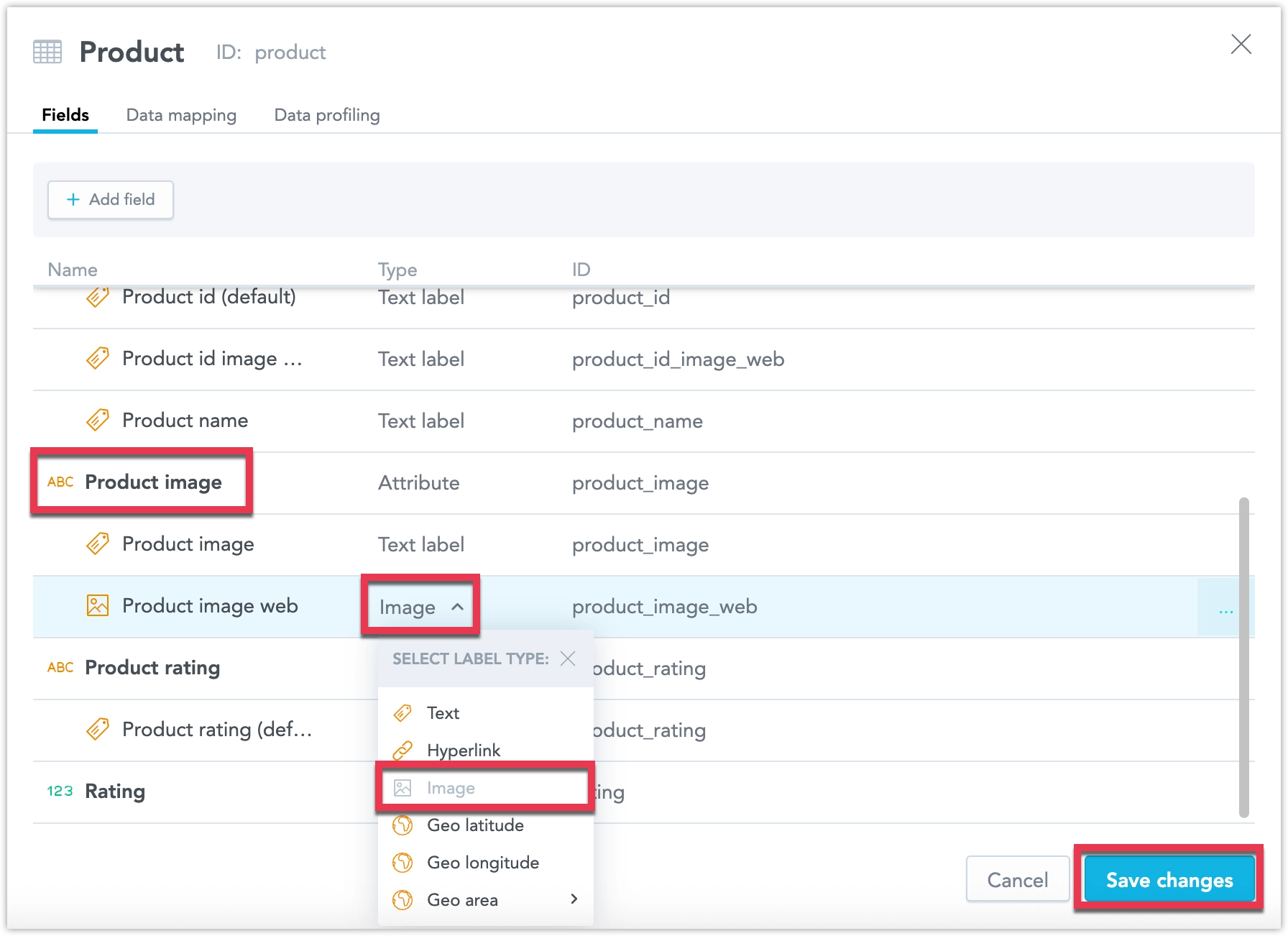
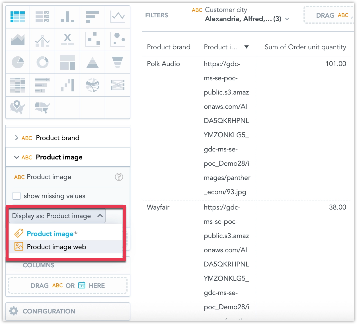
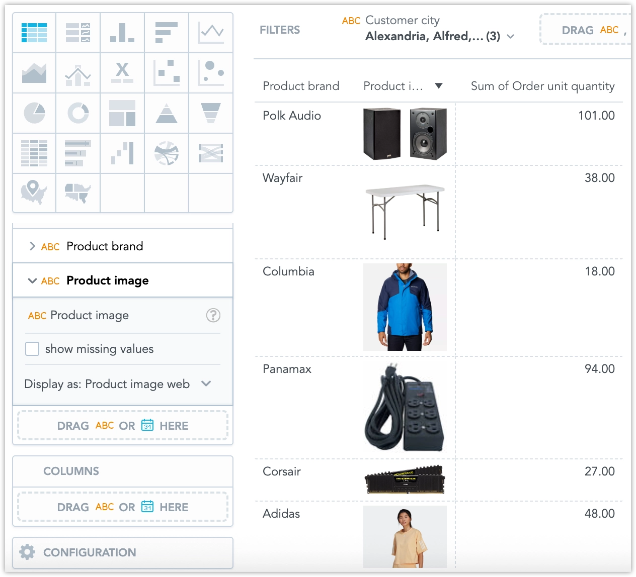
Display Images
Repeaters can images directly from URLs specified within the data.
Steps:
Ensure the attribute that holds the image URLs is labeled as Image in the logical data model.
Select this image label in the Display as setting.
The images are now displayed.
Cells > Wrap text affect how images are displayed:
Limits
If you show metrics in rows, you can display up to 1000 data elements horizontally. Similarly, if metrics are arranged in columns, the data element limit applies vertically.
Sorting is not available in rows containing metrics.
If you change column headers into row headers, the columns that were manually resized return to their default width. This cannot be further modified manually.
Do not use Rollup Totals with Measure Value Filters or Ranking Filters. In Analytical Designer, if you add a Measure Value Filter or Ranking Filter where a Rollup Total exists, the Rollup Total will be removed.
| Bucket | Limit |
|---|---|
| Metrics | 20 metrics if Columns attributes are used; or 100 metrics if Columns bucket is left empty |
| Rows | 20 attributes if Columns attributes are used; or 50 attributes if Columns bucket is left empty |
| Columns | 20 attributes (bucket is available only if there are 20 metrics or fewer and 20 row attributes or fewer) |