Pie Chart
Pie charts show data as proportional segments of a disc. They can be segmented by either multiple metrics or an attribute, and allow viewers to visualize the composition or distribution of a whole. Pie charts are commonly used to display market shares, budget allocations, or demographic distributions. For example, a pie chart can illustrate the percentage of sales contributed by different product categories.
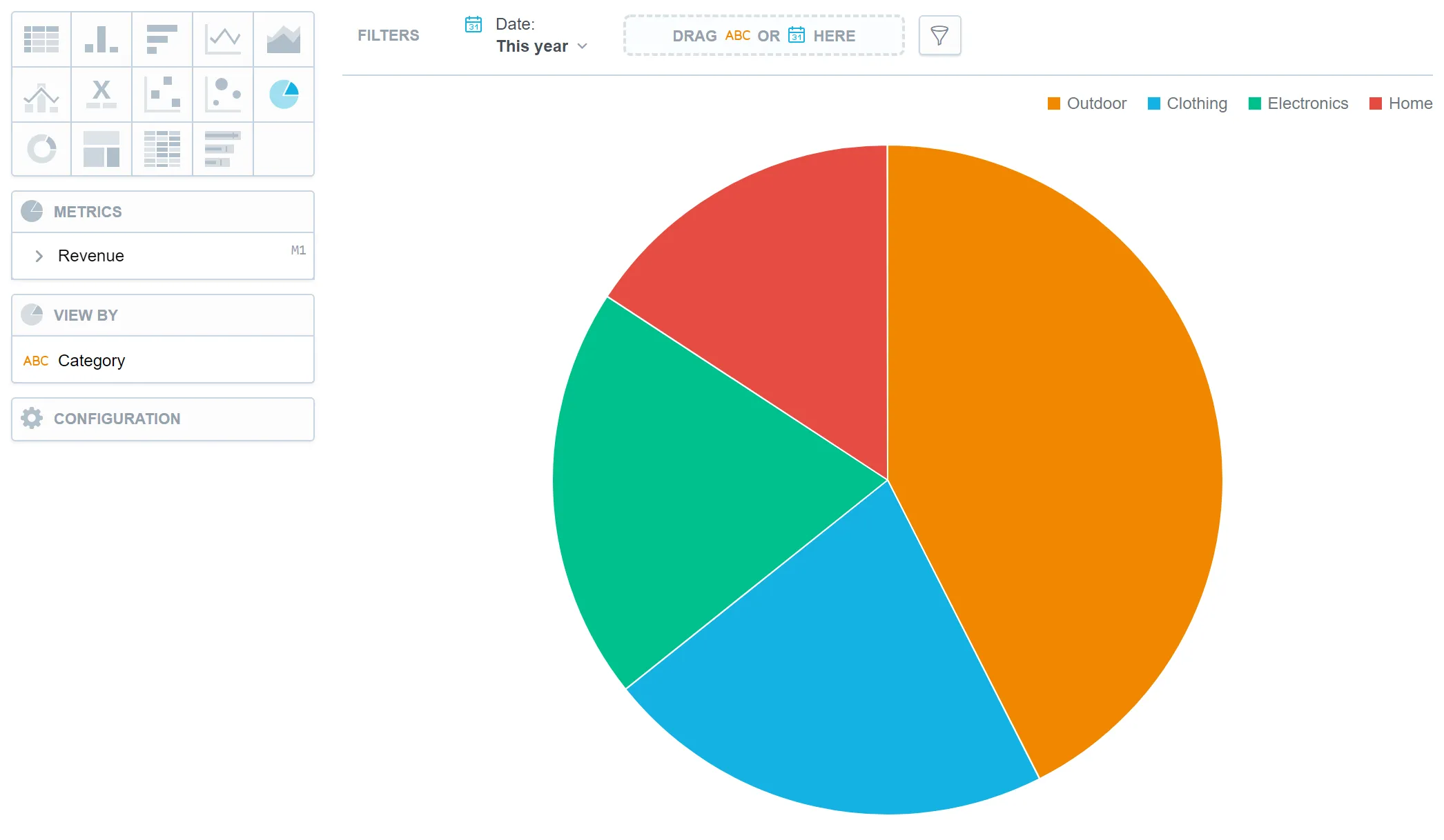
Pie charts have the following sections:
- Metrics
- View by
- Configuration
In pie charts, you can also display the values as a percentage. To do so, add a date or an attribute to the View by section.
For information about common characteristics and settings of all visualizations, see the Visualization Types section.
Limits
| Bucket | Limit |
|---|---|
| Metrics | 20 metrics (to add more than one metric, Stack by bucket must be empty) |
| View by | 1 attribute (this bucket is available only if there is exactly one metric) |