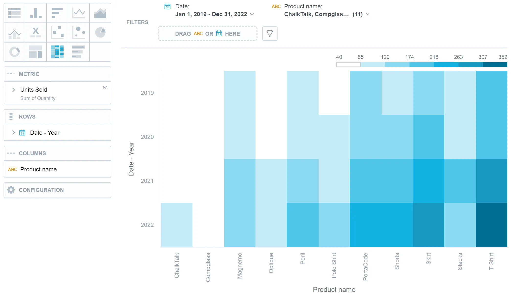
Heatmap
Heatmaps display data as a matrix where individual values, or the magnitude or density of data are represented using color gradients. Because they simplify complex data and help users quickly identify areas of high or low values in a visually intuitive manner, they are particularly useful for identifying patterns, correlations, or variations in large datasets.
Examples of common uses include tracking website traffic by time and page, analyzing stock market performance by sector and time, or displaying population density across different regions.
Heatmaps have the following sections:
- Metric
- Rows
- Columns
- Configuration
The legend above the heatmap shows the values of individual colors. The higher the value is, the darker the color is.
Clicking a value in the legend does not hide it from the visualization.
In Configuration > Canvas > Labels style, you can choose Backplate to add a background behind chart labels. This makes labels easier to read because the backplate (white by default) creates higher contrast with the chart colors.
For information about common characteristics and settings of all visualizations, see the Visualization Types section.
Limits
| Bucket | Limit |
|---|---|
| Metrics | 1 metric |
| View by | 1 attribute |
| Stack by | 1 attribute |