Bubble Chart
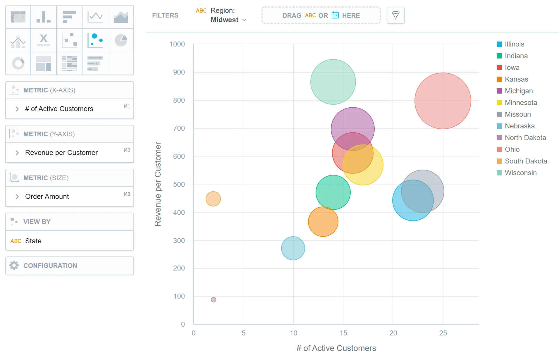
Bubble charts are similar to scatter plots. They show data points as bubbles using Cartesian coordinates. Because they show three dimensions of data, two numeric variables represented by the x and y axes, and a third variable represented by the size of the bubbles, they provide a visually engaging and intuitive representation of multi-dimensional data.
They are commonly used to show relationships, comparisons, and patterns among data points. For example, a bubble chart can represent the population size of different cities based on their geographical location (x and y coordinates) while using the size of the bubbles to indicate the GDP or pollution levels of those cities. Bubble charts are also useful for visualizing market data, project management metrics, and scientific research data.
Bubble charts have the following sections:
- Metric (X-axis)
- Metric (Y-axis)
- Metric (Size)
- View by
- Configuration
If you add an attribute to the View by section, the bubbles get different colours for each attribute value.
For information about common characteristics and settings of all visualizations, see the Visualization Types article.
Limits
| Bucket | Limit |
|---|---|
| Metric (x-axis) | 1 metric |
| Metric (y-axis) | 1 metric |
| Metric (size) | 1 metric |
| View by | 1 attribute |