Line Chart
Line charts show data as line-connected dots. Line charts can display changes in metrics across time or progress across a series of stages, making them widely used in various fields including finance, analytics, and research. They are commonly used to represent continuous data such as stock prices, temperature variations, or sales trends. For example, a line chart can showcase the monthly sales performance of a product, with each point on the line representing the sales value for a specific time period.
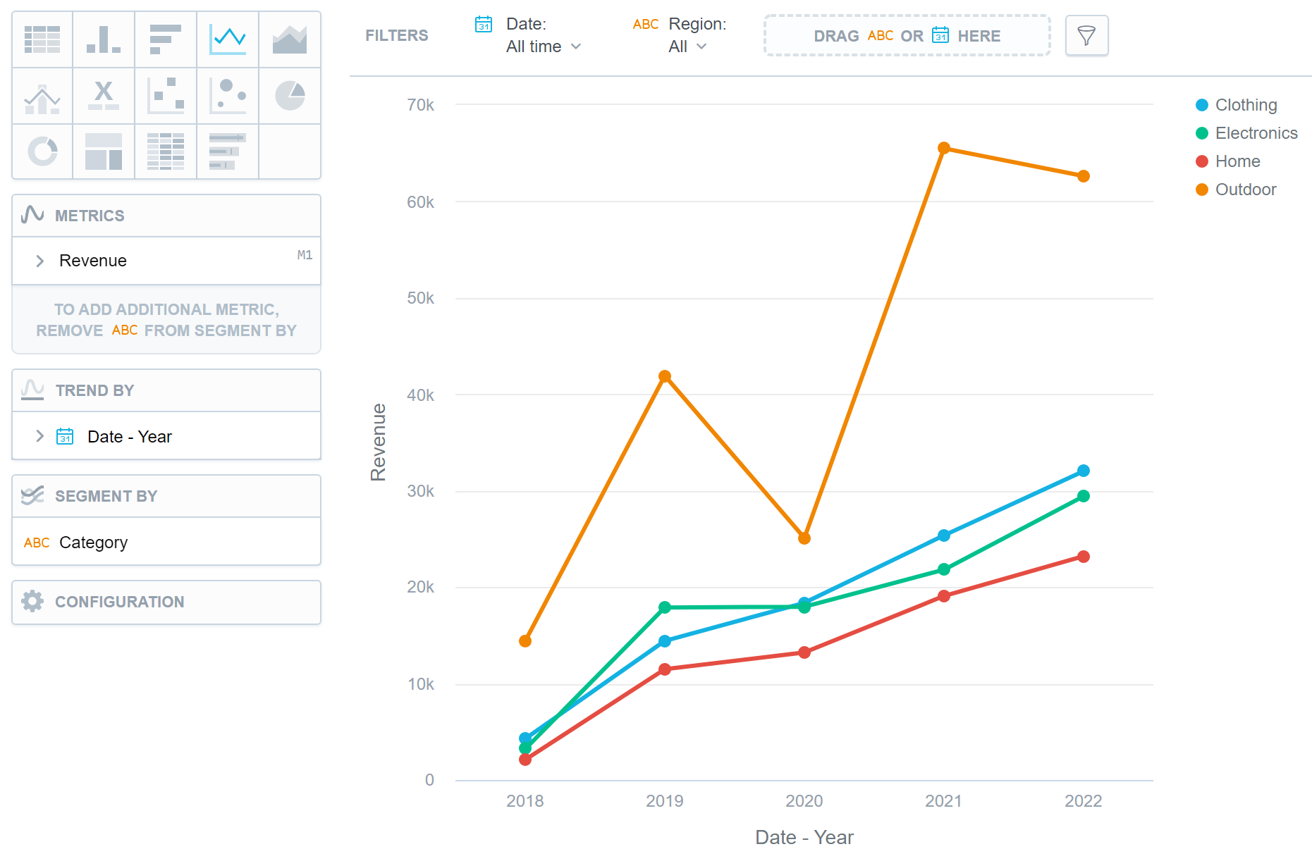
Line charts have the following sections:
- Metrics
- Trend by
- Segment by
- Configuration
If you configure the Trend by section and add a date or an attribute, you display a trend line. Trend lines connect individual metric/attribute values.
In line charts, you can also:
Display the values as a percentage.
To do so, add a date or an attribute to the Trend by section.
Display individual values of an attribute.
To do so, add an attribute to the Segment by section. You must have only one item in the Metrics section.
Display the chart as a continuous line even if some values are missing.
To do so, check the Continuous line checkbox in the Configuration > Canvas section. If checked, the line skips the missing value and connects the next available value.
Compare your data to the previous period or the same period of the previous year.
For details, see the Time over Time Comparison section.
Display a secondary y-axis on the right side.
To do so, select the show on right axis checkbox in a metric’s settings.
For information about common characteristics and settings of all visualizations, see the Visualization Types section.
Limits
| Bucket | Limit |
|---|---|
| Metrics | 20 metrics (to add more than one metric, Stack by bucket must be empty) |
| View by | 2 attributes |
| Stack by | 1 attribute (this bucket is available only if there is exactly one metric) |