Combo Chart
Combo charts combine two types of charts - column, area, or line - into a single visualization. Because Combo charts provide a compact representation of multiple data sets, they are particularly useful when there is a need to present different types of data or multiple variables simultaneously. Common uses of combo charts include showing sales revenue as columns and sales growth as a line, or combining a column chart with a line chart to illustrate both quantity and percentage change.
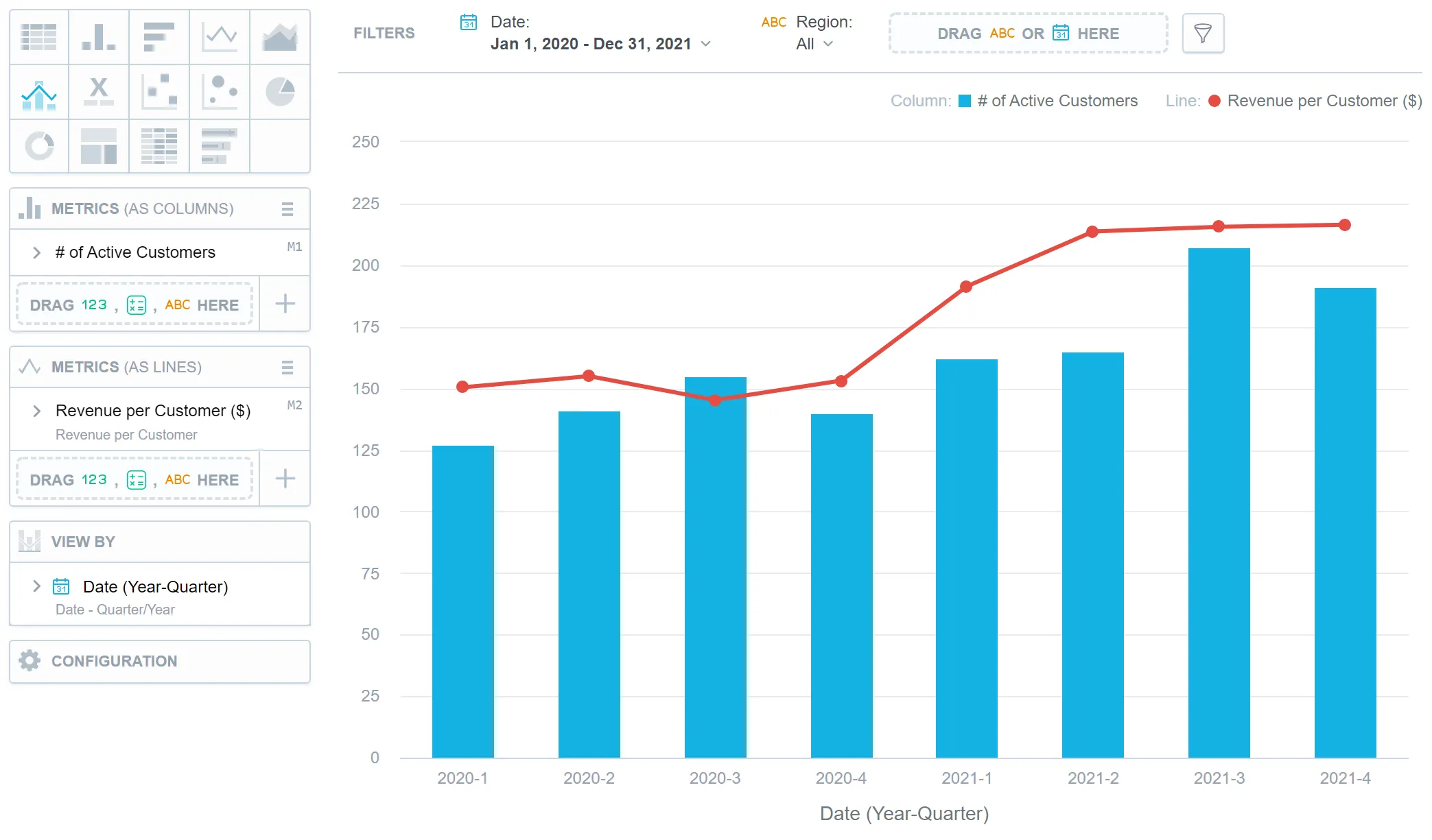
Combo charts have the following sections:
- Two Metrics sections (as columns/lines/areas)
- View by
- Configuration
In combo charts, you can:
Display the values as a percentage.
To do so, add a date or an attribute to the View by section.
Display the chart as a continuous line even if your data contain empty values.
To do so, check the Continuous line checkbox in the Configuration | Canvas section. By default, the line is interrupted if it is supposed to display an empty value.
Compare your data to the previous period or the same period of the previous year.
For details, see the Time over Time Comparison section.
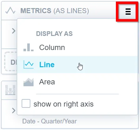
Display a secondary y-axis on the right side.
To do so, select the show on right axis checkbox under the hamburger icon in the second Metrics section.
To change the visualization types used in your combo chart, click the hamburger icon next to the Metrics title and select the visualization type for a particular metric.
For information about common characteristics and settings of all visualizations, see the Visualization Types section.
Technical Limits
| Feature | Limit | Comment |
|---|---|---|
| Maximum data points in one chart | 3,000 | This is a display (visualization) limit. If you exceed this limit and want to see all data, change the visualization type to Table. |