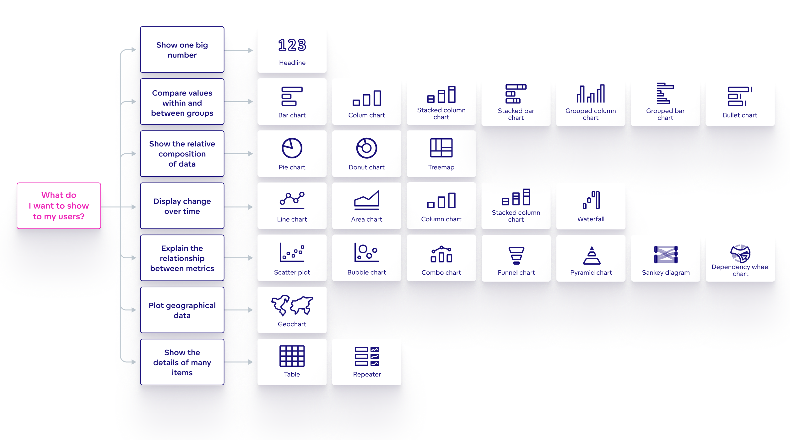
Visualization Types
In Analytical Designer, you can visualize your data using various types of visualizations. For information about creating visualizations, see Create Visualizations.
Each visualization type has different options and may enable you to display different types of data:
The table below shows what you can configure in each visualization type:
| Visualization type | Metrics 1) | View by 2) | Stack by 3) | Attributes | Trend by 2) | Segment by 3) | Rows | Columns | Configuration 4) | Location |
|---|---|---|---|---|---|---|---|---|---|---|
| Bar chart | ✅ | ✅ 5) | ✅ | ➖ | ➖ | ➖ | ➖ | ➖ | ✅ | ➖ |
| Bubble chart | ✅ 8) | ✅ | ➖ | ➖ | ➖ | ➖ | ➖ | ➖ | ✅ | ➖ |
| Bullet chart | ✅ 8) | ✅ 6) | ➖ | ➖ | ➖ | ➖ | ➖ | ➖ | ✅ | ➖ |
| Column chart | ✅ | ✅ 6) | ✅ | ➖ | ➖ | ➖ | ➖ | ➖ | ✅ | ➖ |
| Combo chart | ✅ 8) | ✅ | ➖ | ➖ | ➖ | ➖ | ➖ | ➖ | ✅ | ➖ |
| Dependency Wheel | ✅ | ➖ | ➖ | ✅ 6) | ➖ | ➖ | ➖ | ➖ | ✅ | ➖ |
| Donut chart | ✅ | ✅ | ➖ | ➖ | ➖ | ➖ | ➖ | ➖ | ✅ | ➖ |
| Funnel chart | ✅ | ✅ | ➖ | ➖ | ➖ | ➖ | ➖ | ➖ | ✅ | ➖ |
| Headline | ✅ 8) | ➖ | ➖ | ➖ | ➖ | ➖ | ➖ | ➖ | ✅ | ➖ |
| Heatmap | ✅ | ➖ | ➖ | ➖ | ➖ | ➖ | ✅ | ✅ | ✅ | ➖ |
| Line chart | ✅ | ➖ | ➖ | ➖ | ✅ | ✅ | ➖ | ➖ | ✅ | ➖ |
| Pie chart | ✅ | ✅ | ➖ | ➖ | ➖ | ➖ | ➖ | ➖ | ✅ | ➖ |
| Pivot table | ✅ | ➖ | ➖ | ➖ | ➖ | ➖ | ✅ | ✅ | ➖ | ➖ |
| Pyramid chart | ✅ | ✅ | ➖ | ➖ | ➖ | ➖ | ➖ | ➖ | ✅ | ➖ |
| Repeater | ✅ | ✅ | ➖ | - | ➖ | ➖ | ✅ | ✅ | ✅ | ➖ |
| Sankey chart | ✅ | ➖ | ➖ | ✅ 6) | ➖ | ➖ | ➖ | ➖ | ✅ | ➖ |
| Scatter plot | ✅ 8) | ➖ | ➖ | ✅ 7) | ➖ | ➖ | ➖ | ➖ | ✅ | ➖ |
| Stacked area chart | ✅ | ✅ | ✅ | ➖ | ➖ | ➖ | ➖ | ➖ | ✅ | ➖ |
| Treemap | ✅ | ✅ | ➖ | ➖ | ➖ | ✅ | ➖ | ➖ | ✅ | ➖ |
| Waterfall chart | ✅ | ✅ | ➖ | ➖ | ➖ | ➖ | ➖ | ➖ | ✅ | ➖ |
1) Allows metrics based on facts, metrics created using MAQL, and aggregated attributes.
2) Allows only one attribute or date.
3) Requires only one item in the Metrics section.
4) The configuration options differ for each visualization type.
5) Allows more than one attribute or date if the Stack by section is not used.
6) Allows more than one attribute or date.
7) Allows only one attribute.
8) Has multiple Metrics sections.
If you switch from one visualization type to another, the configuration of the visualization may change. For example, if you switch from a column chart with three items in the Metrics section and two items in the View by section to a pie chart, the pie chart displays only the first item in each section. If you switch back without changing anything, all the original items are displayed again.
Common Visualization Characteristics
In every visualization, you can:
Display metrics and attributes.
Filter each metric and attribute by date.
For more details, see the Filter Metrics in a Visualization by Date section.
Filter each metric and attribute by attributes.
You can also click an attribute value in the visualization legend to hide the value from the visualization. This does not apply to heatmaps.
Rename any metric or attribute.
For more details, see the Rename Metrics, Attributes, and Dates in Visualizations section.
Change visualization properties.
For more details, see the Configure Visualization Properties section.