5. Create Metrics
Metrics are custom calculations that draw on various data points (facts) and categories (attributes) to provide deeper insights into your data. Acting like specialized queries, metrics allow you to explore and analyze information in more sophisticated ways. Once created, a metric is stored in your workspace, ensuring consistency and reusability across multiple visualizations. You can also build new metrics based on existing ones, making it easier to perform complex or nested calculations as your analytical needs evolve.
Create Simple Metric
You will define a straightforward metric that sums the total order amount in your dataset.
Steps:
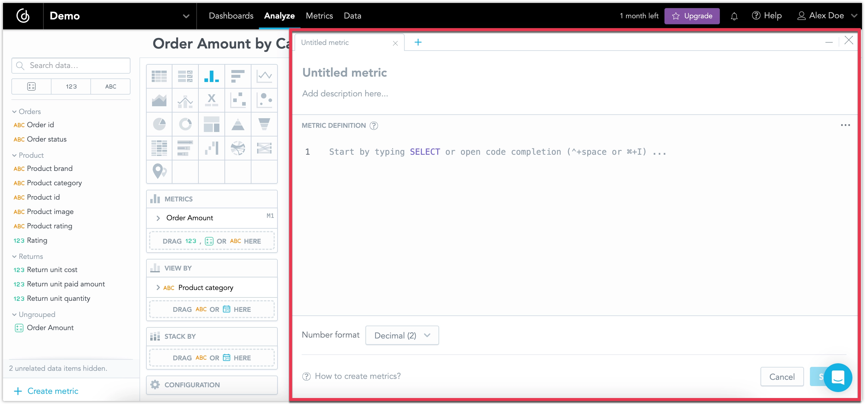
In your workspace, switch to the Metrics tab and select Create metric.
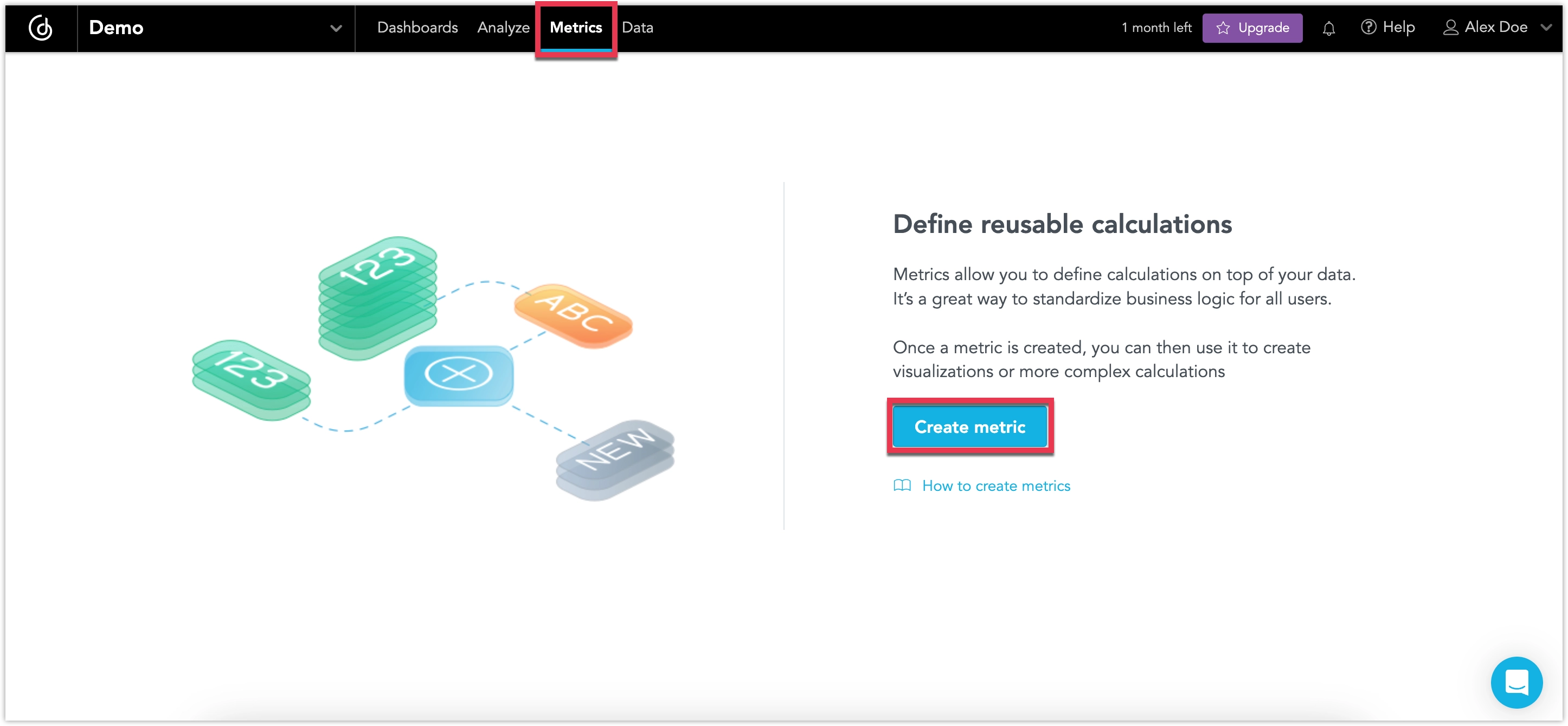
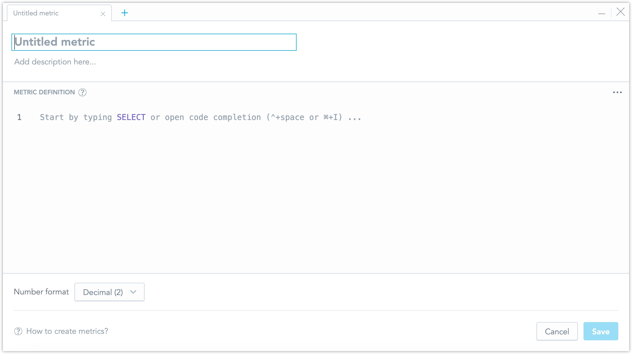
This opens the metric editor:
Name the metric
Order Amountand give it a descriptionTotal value of all ordered products, then write the metric definition by typing out:SELECT SUM({fact/order_unit_quantity}*{fact/order_unit_price})Notice that as you type the metric definition, the metric editor gives you suggestions on what might come next, based on your connected database.
Click Save.
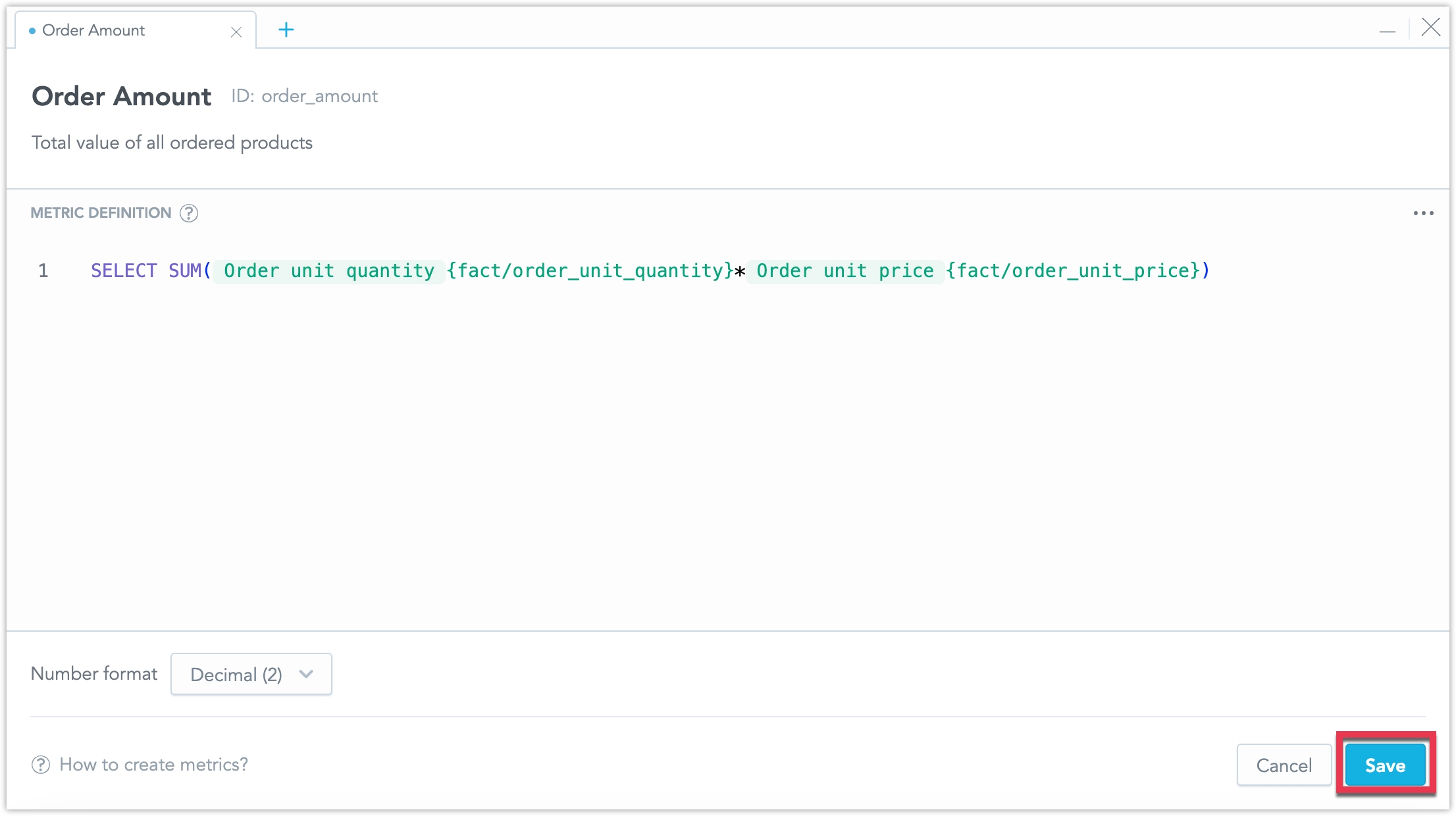
You have created your first metric.
To create a metric, submit a POST request to /api/v1/entities/workspaces/<WORKSPACE_ID>/metrics:
curl $HOST_URL/api/v1/entities/workspaces/<WORKSPACE_ID>/metrics \
  -H "Content-Type: application/vnd.gooddata.api+json" \
  -H "Accept: application/vnd.gooddata.api+json" \
  -H "Authorization: Bearer <API_TOKEN>" \
  -X POST \
  -d '{
  "data": {
    "id": "order_amount",
    "type": "metric",
    "attributes": {
      "title": "Order Amount",
      "description": "Total value of all ordered products",
      "createdAt": "2025-01-30 14:42",
      "content": {
        "format": "#,##0.00",
        "maql": "SELECT SUM({fact/order_unit_quantity}*{fact/order_unit_price})"
      }
    }
  }
}' | jq .
Use Metric In Visualization
Now that you have created a metric, you can use it inside a visualization.
Switch to the Analyze tab and set the type of visualization to Column chart.
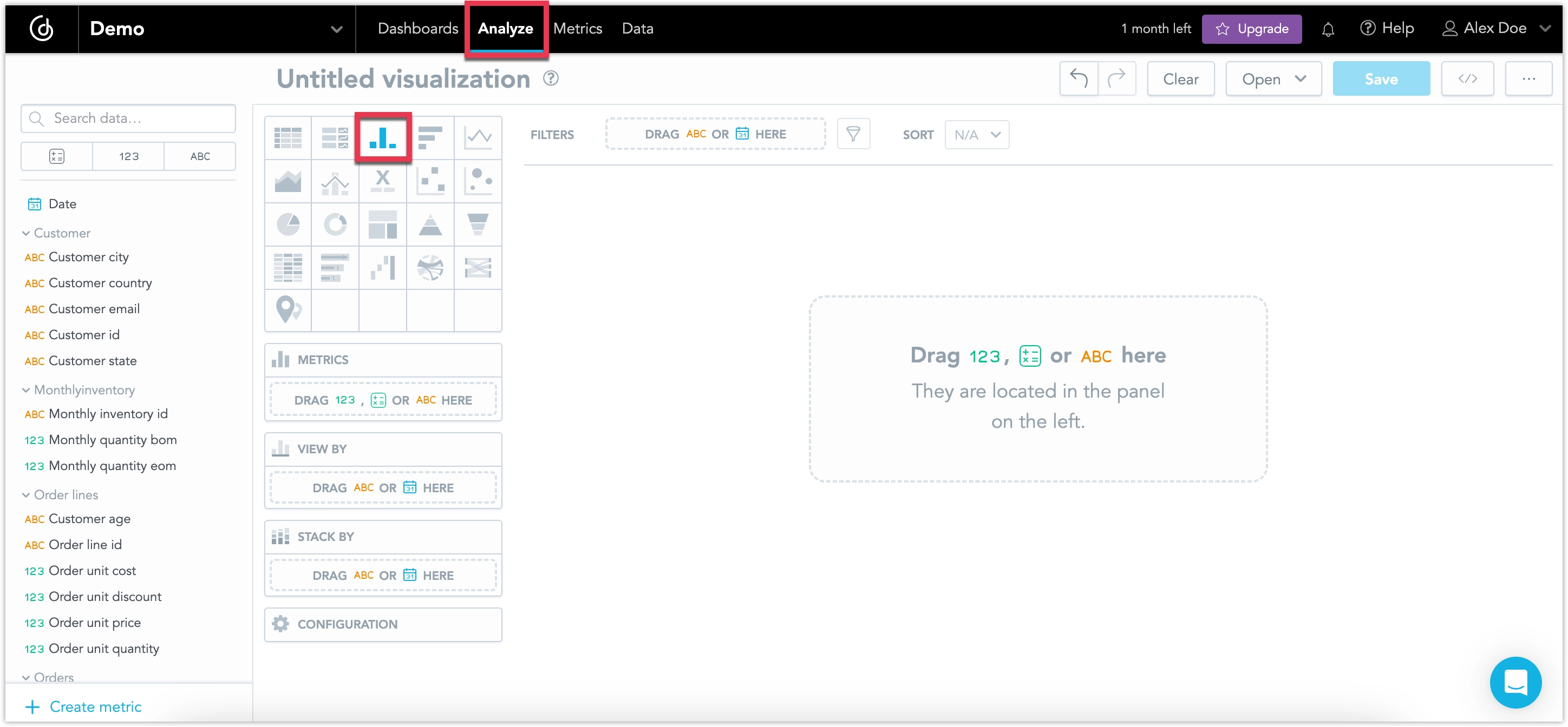
Drag and drop your metric Order Amount from the data catalog into the Metrics panel.
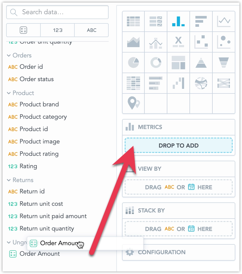
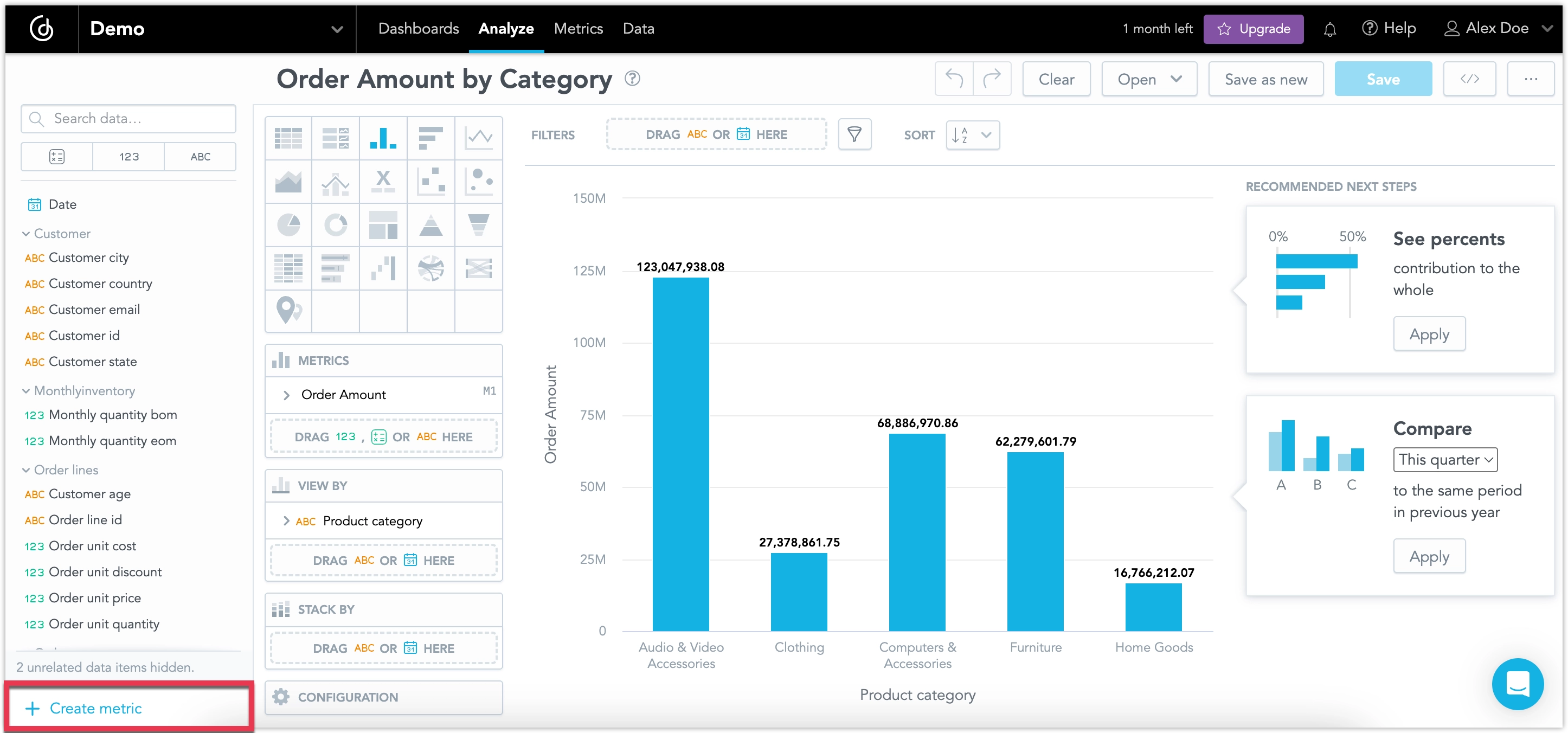
You can now see your metric as in the column chart.
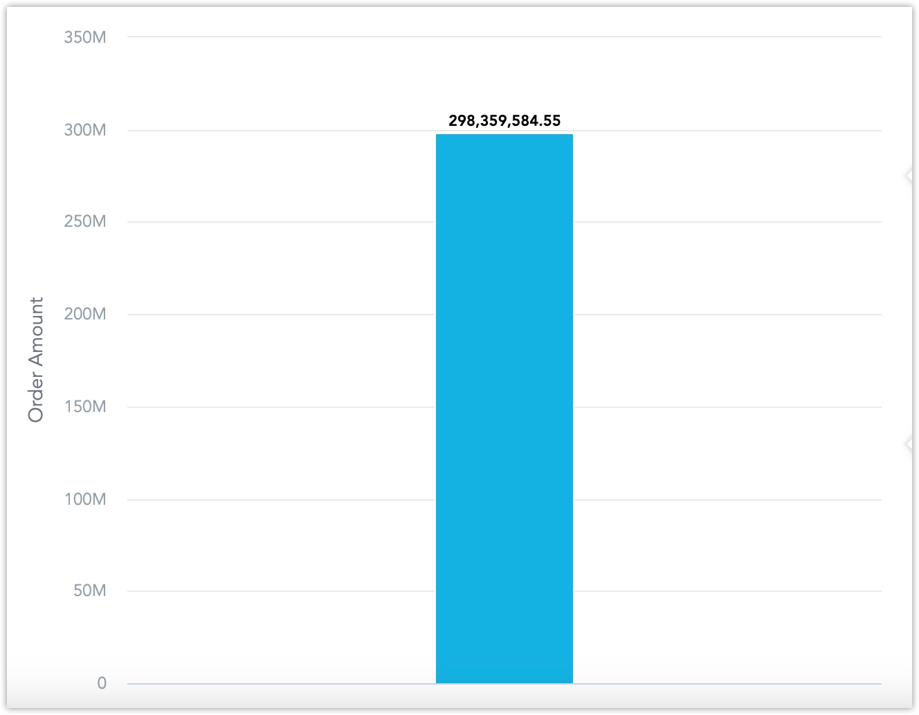
A single metric does not make for a very interesting visualization. Let’s slice it by some attributes.
Drag and drop the Product category attribute into the View by panel to slice the metric Order Amount by category.
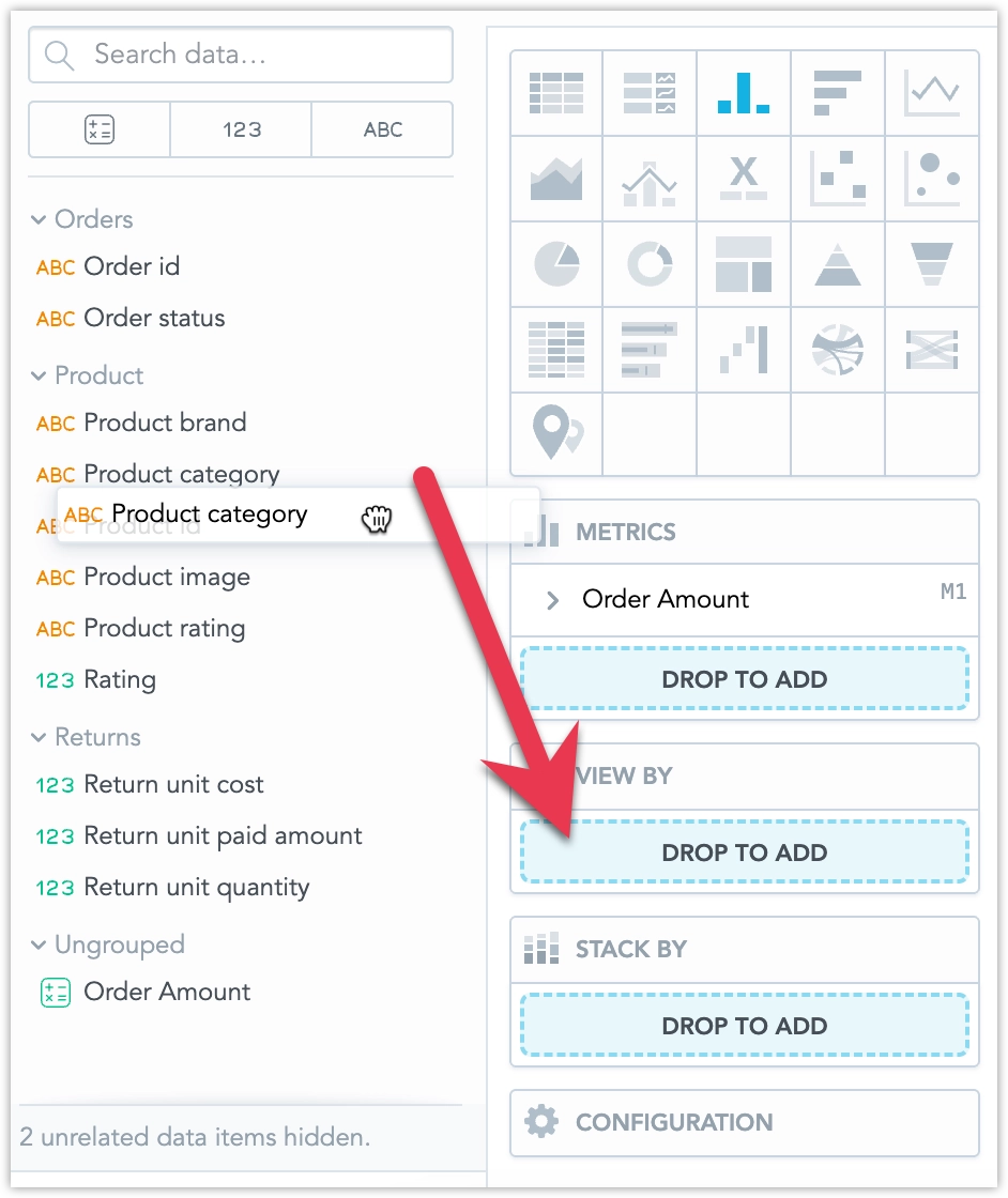
Your metric is now sliced into product categories.
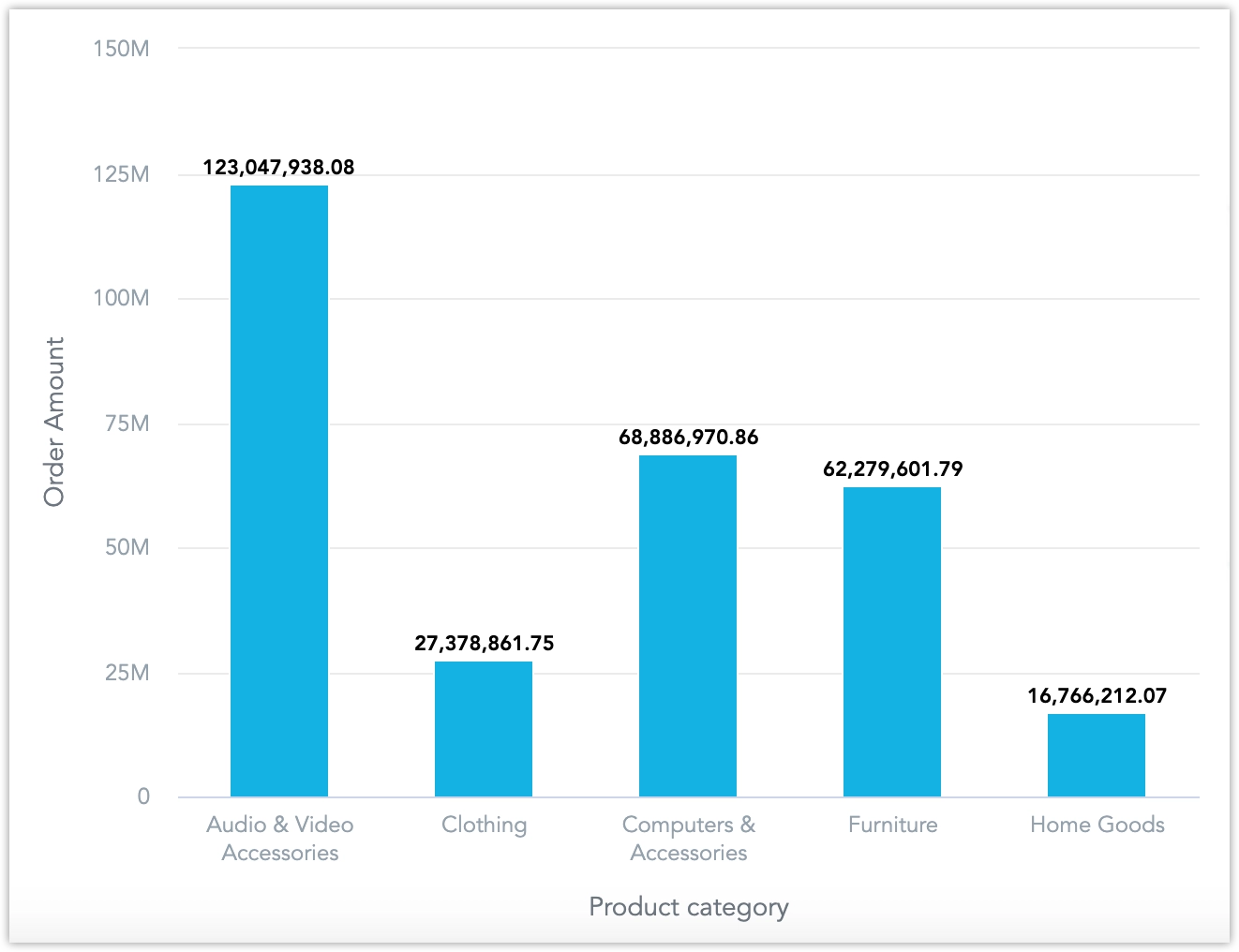
Give your visualization a title
Order Amount by Categoryand click Save.You have used your first metric in a visualization.
To use the metric in a visualization, submit a POST request to /api/v1/entities/workspaces/<WORKSPACE_ID>/visualizationObjects:
curl $HOST_URL/api/v1/entities/workspaces/<WORKSPACE_ID>/visualizationObjects \
  -H "Content-Type: application/vnd.gooddata.api+json" \
  -H "Accept: application/vnd.gooddata.api+json" \
  -H "Authorization: Bearer <API_TOKEN>" \
  -X POST \
  -d '{
  "data": {
    "id": "orderAmountUsingMetric",
    "type": "visualizationObject",
    "attributes": {
      "title": "Order Amount by Category",
      "description": "",
      "content": {
        "buckets": [
          {
            "items": [
              {
                "measure": {
                  "localIdentifier": "c3437bdeb28c4a94bc7ff5dc0a2f7e18",
                  "definition": {
                    "measureDefinition": {
                      "item": {
                        "identifier": {
                          "id": "order_amount",
                          "type": "metric"
                        }
                      },
                      "computeRatio": false,
                      "filters": []
                    }
                  },
                  "title": "Order Amount"
                }
              }
            ],
            "localIdentifier": "measures"
          },
          {
            "items": [
              {
                "attribute": {
                  "localIdentifier": "391ffb80804845d6bb4b2864148fd5db",
                  "displayForm": {
                    "identifier": {
                      "id": "product_category",
                      "type": "label"
                    }
                  }
                }
              }
            ],
            "localIdentifier": "view"
          }
        ],
        "filters": [],
        "sorts": [],
        "properties": {},
        "visualizationUrl": "local:column",
        "version": "2"
      }
    }
  }
}' | jq .
Create a Nested Metric
You can use an existing metric to create new metrics. Use your previously created metric, Order Amount, to create a new metric, Revenue, that will filter out any undelivered orders. Note that you can create a new metric on the go, without having to leave the Analyze tab.
Steps:
Create a new metric; You can do this without having to leave the Analyze tab by
this opens the metric editor:
Give the metric a title
Revenueand a descriptionRevenue from delivered products.Copy and paste in the following MAQL query:
SELECT {metric/order_amount} WHERE {label/order_status} = "Processed"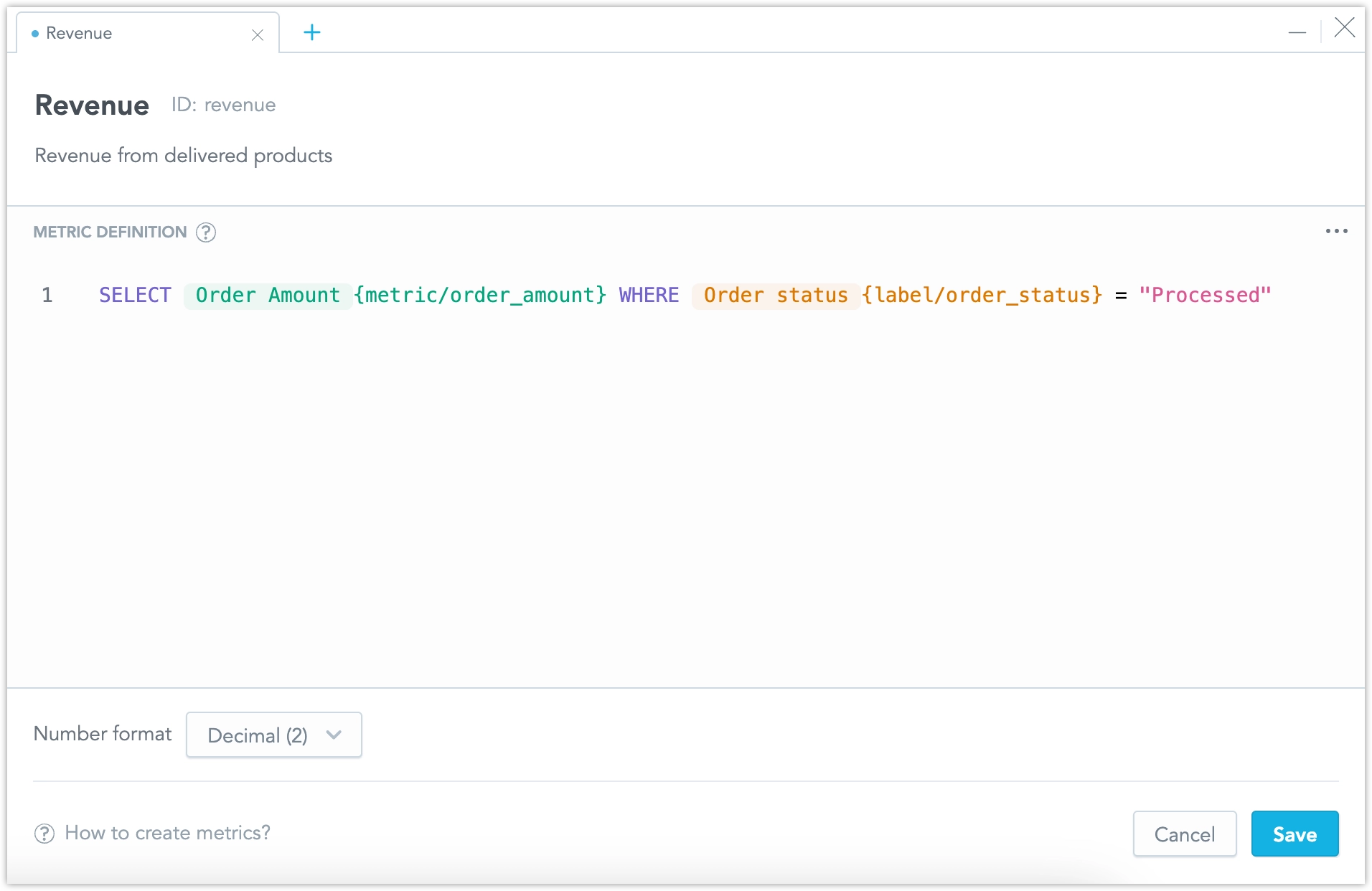
Click Save.
Switch to a Line chart and drop your newly created Revenue metric into the Metrics bucket:
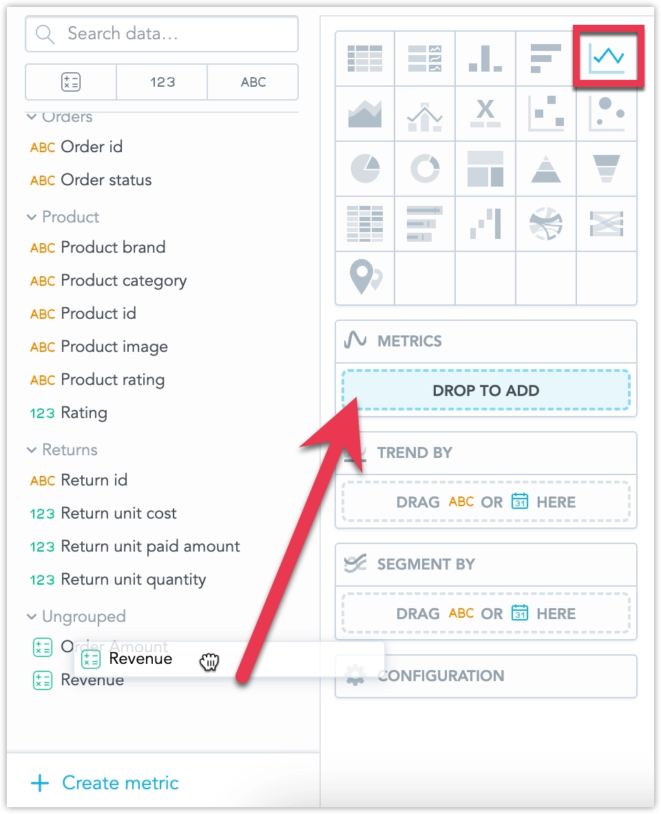
Complete the visualization by adding a Date metric into the Trend by bucket, and Customer country attribute into the Segment by bucket:
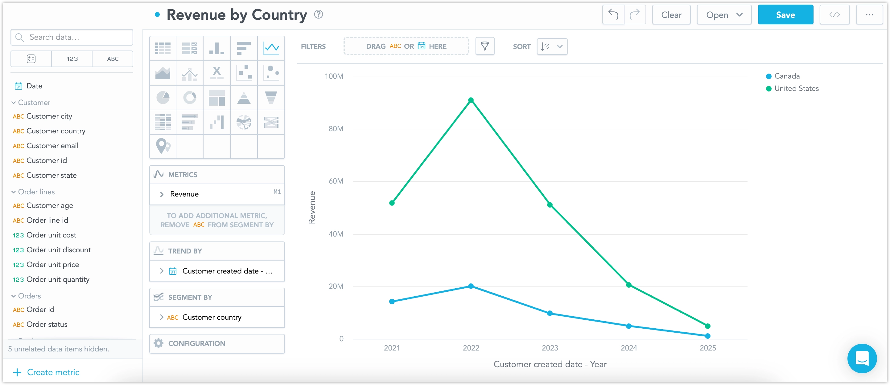
Save the visualizaiton.
To create a nested metric, submit a POST request to /api/v1/entities/workspaces/<WORKSPACE_ID>/metrics:
curl $HOST_URL/api/v1/entities/workspaces/<WORKSPACE_ID>/metrics \
  -H "Content-Type: application/vnd.gooddata.api+json" \
  -H "Accept: application/vnd.gooddata.api+json" \
  -H "Authorization: Bearer <API_TOKEN>" \
  -X POST \
  -d '{
  "id": "revenue",
  "type": "metric",
  "attributes": {
    "title": "Revenue",
    "description": "Revenue from delivered products",
    "createdAt": "2025-02-05 17:35",
    "content": {
      "format": "#,##0.00",
      "maql": "SELECT {metric/order_amount} WHERE {label/order_status} = \"Processed\""
    }
  }
}' | jq .
To use the metric in a visualization, submit a POST request to /api/v1/entities/workspaces/<WORKSPACE_ID>/visualizationObjects:
curl $HOST_URL/api/v1/entities/workspaces/<WORKSPACE_ID>/visualizationObjects \
  -H "Content-Type: application/vnd.gooddata.api+json" \
  -H "Accept: application/vnd.gooddata.api+json" \
  -H "Authorization: Bearer <API_TOKEN>" \
  -X POST \
  -d '{
  "data": {
    "id": "22246615-c6bf-4979-a123-8a09fca3e901",
    "type": "visualizationObject",
    "attributes": {
      "title": "Revenue by Country",
      "description": "",
      "content": {
        "buckets": [
          {
            "items": [
              {
                "measure": {
                  "localIdentifier": "8b66ef08b0e34c36884dff4144d6ee6c",
                  "definition": {
                    "measureDefinition": {
                      "item": {
                        "identifier": {
                          "id": "revenue",
                          "type": "metric"
                        }
                      },
                      "filters": []
                    }
                  },
                  "title": "Revenue"
                }
              }
            ],
            "localIdentifier": "measures"
          },
          {
            "items": [
              {
                "attribute": {
                  "localIdentifier": "8993f23fd77f492ab4bd7b517383e102",
                  "displayForm": {
                    "identifier": {
                      "id": "customer_created_date.year",
                      "type": "label"
                    }
                  }
                }
              }
            ],
            "localIdentifier": "trend"
          },
          {
            "items": [
              {
                "attribute": {
                  "localIdentifier": "5578881c15ff4017b756fdb421e90d12",
                  "displayForm": {
                    "identifier": {
                      "id": "customer_country",
                      "type": "label"
                    }
                  }
                }
              }
            ],
            "localIdentifier": "segment"
          }
        ],
        "filters": [],
        "sorts": [],
        "properties": {},
        "visualizationUrl": "local:line",
        "version": "2"
      }
    }
  }
}' | jq .