Donut Chart
Donut charts show data as proportional segments of a disc with a hollowed out center. Donut charts can be segmented by either multiple metrics or an attribute, and allow viewers to visualize component parts of a whole. Similar to pie charts, they are mostly used for showing the proportion or distribution of categorical data. For example, a donut chart can represent the percentage of market share for different companies, with each segment indicating the relative size of a company’s market share. Donut charts provide an intuitive and visually appealing way to understand relative proportions within a data set.
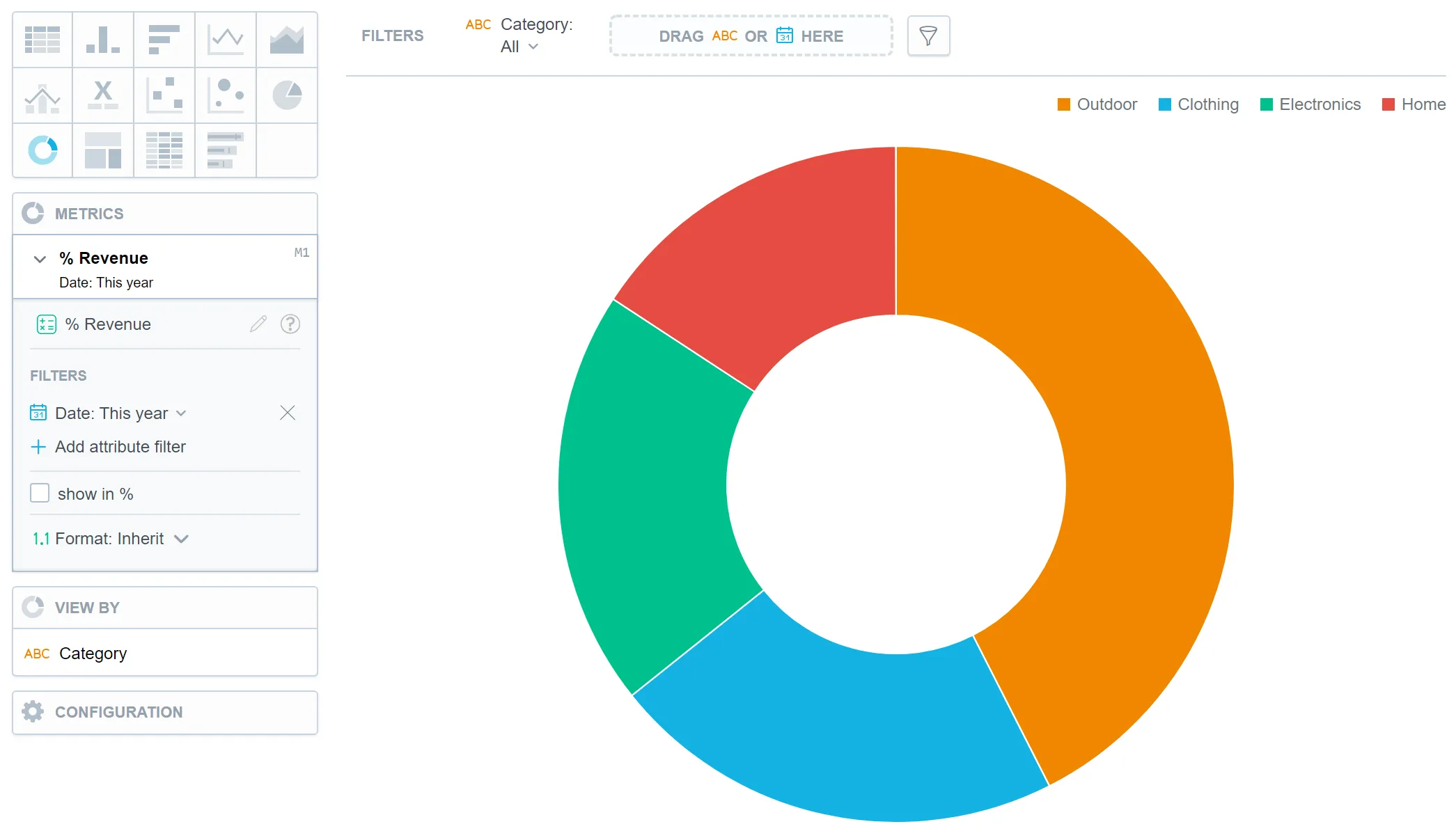
In donut charts, you can also display the values as a percentage. To do so, add a date or an attribute to the View by section.
For information about common characteristics and settings of all visualizations, see the Visualization Types section.