Column Chart
Similar to bar charts, Column charts are used to compare and display categorical data or quantitative values across different categories in the form of vertical bars. They are commonly used to illustrate trends, comparisons, and distributions. For example, a column chart can be used to show the monthly revenue of different products, with each column representing the revenue for a specific month.
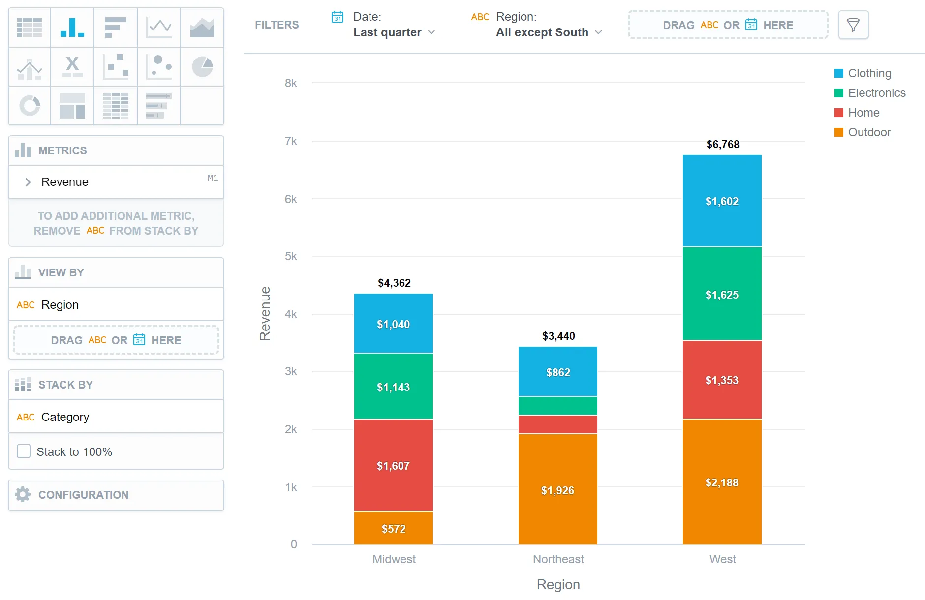
Column charts have the following sections:
- Metrics
- View by
- Stack by
- Configuration
In column charts, you can also:
Display the values as a percentage.
To do so, add a date or attributes to the View by section.
Stack the chart by attributes.
To add attributes to the Stack by section, you must have only one item in the Metrics section.
If you have multiple metrics in the Metrics section, you can stack the metrics. For details, see Stack Metrics.
Compare your data to the previous period or the same period of the previous year.
For details, see the Time over Time Comparison section.
Display a secondary y-axis on the right side.
To do so, select the show on right axis checkbox in a metric’s settings.
Column Charts vs Bar Charts
In column charts, the data is sorted by the values in the View by section.
In bar charts, the data is sorted by the values of the first item in the Metrics section.
For information about common characteristics and settings of all visualizations, see the Visualization Types section.
Technical Limits
| Feature | Limit | Comment |
|---|---|---|
| Maximum data points in one chart | 3,000 | This is a display (visualization) limit. If you exceed this limit and want to see all data, change the visualization type to Table. |