Bar Chart
Bar charts are horizontal visual representations that are commonly used to illustrate trends, comparisons, and distributions. For example, a bar chart can be used to show the sales performance of different products, with each bar representing the sales volume or revenue for a specific product. Bar charts are also useful for displaying survey results, market share comparisons, budget allocations, and population distributions, providing a clear and easy-to-understand visual representation of the data.
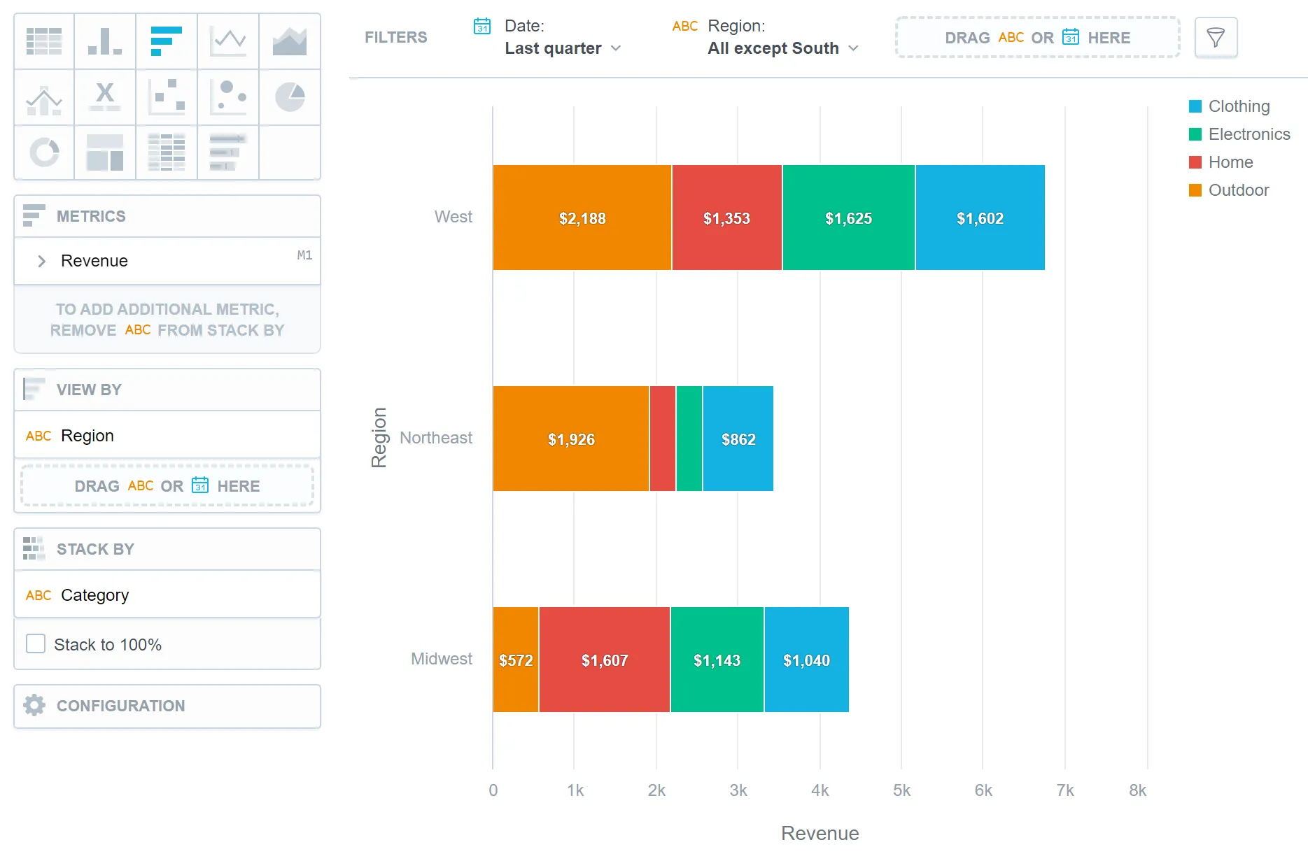
Bar charts have the following sections:
- Metrics
- View by
- Stack by
- Configuration
In bar charts, you can also:
Display the values as a percentage.
To do so, add a date or attributes to the View by section.
Stack the chart by attributes.
To add attributes to the Stack by section, you must have only one item in the Metrics section.
If you have multiple metrics in the Metrics section, you can stack the metrics. For details, see Stack Metrics.
Compare your data to the previous period or the same period of the previous year.
For details, see Time over Time Comparison.
Display a secondary x-axis at the top.
To do so, select the show on top axis checkbox in a metric’s settings.
For information about common characteristics and settings of all visualizations, see Visualization Types.
Limits
| Bucket | Limit |
|---|---|
| Metrics | 20 metrics (to add more than one metric, Stack by bucket must be empty) |
| View by | 2 attributes |
| Stack by | 1 attribute (this bucket is available only if there is exactly one metric) |
| Feature | Limit | Comment |
|---|---|---|
| Maximum data points in one chart | 3,000 | This is a display (visualization) limit. If you exceed this limit and want to see all data, change the visualization type to Table. |